Communicating mathematics with interactive visualizations
Studienfonds Community Conference
Bielefeld, Germany - August 9th 2022
Rasmus Kristoffer Pedersen
Postdoc, Mathematical Modelling, Roskilde University
Slides available online: rasmuspedersen.com/talks/BI
Who I am, and what I do
Postdoc in applied mathematics at Roskilde University, Denmark.
Ph.D. in mathematical modelling of leukemia
Part of the PandemiX research-group, working on historical epidemics and COVID-19.
Written multiple public-communication articles about COVID-19 over the last two years.
Mathematical Modelling
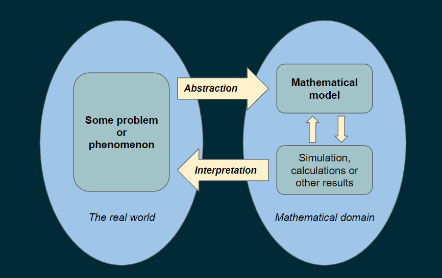
But how does one bring math back to the real world?
Someone has to interpret the results.
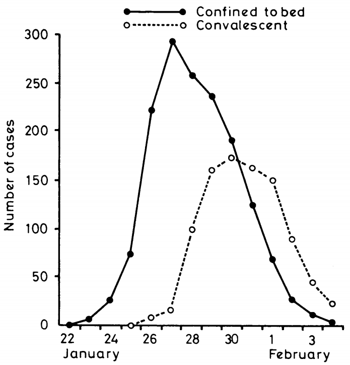
Examples of articles
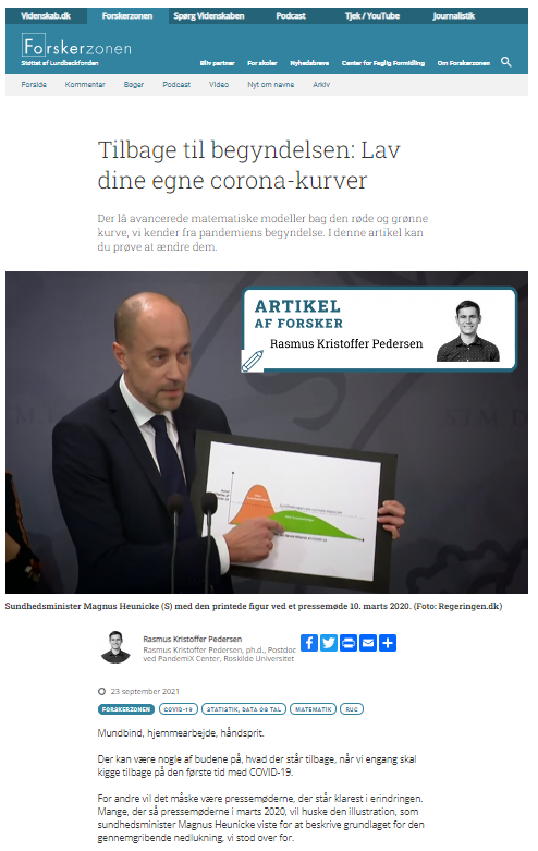
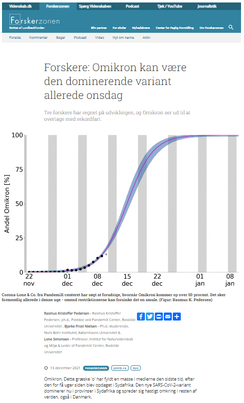
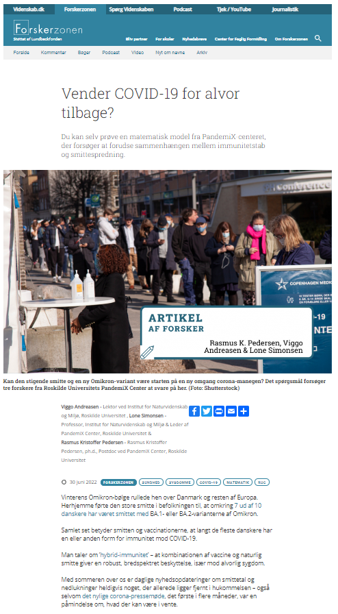
Examples of articles
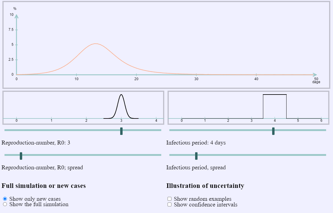
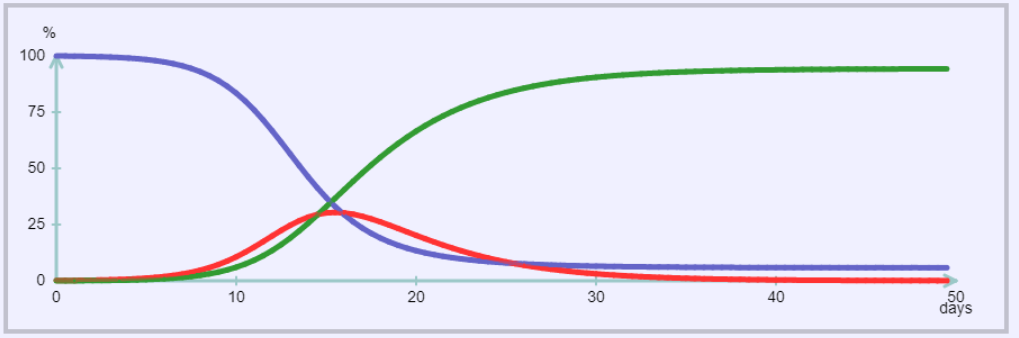
The SIR-model
A "classic" model tracing back to early 1900's.
Describes progression of an epidemic of an infectious disease in a population.
The SIR-model
A "classic" model tracing back to early 1900's.
Describes progression of an epidemic of an infectious disease in a population.
The SIR-model
A "classic" model tracing back to early 1900's.
Describes progression of an epidemic of an infectious disease in a population.
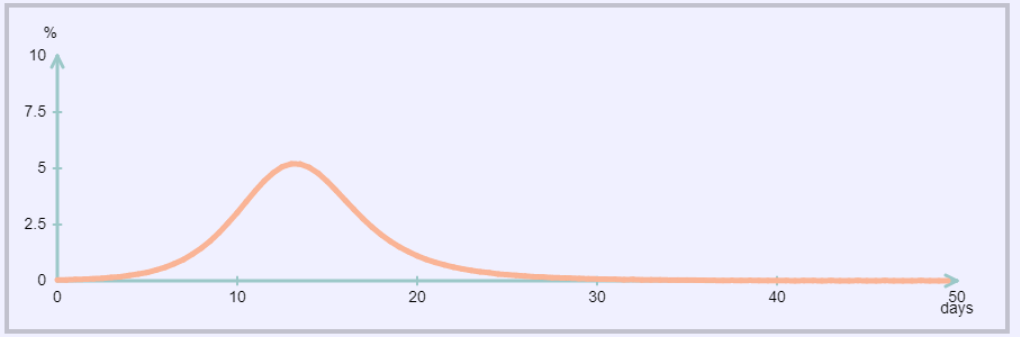
Examples of model-parameters:
- How long are people infectious?
- How many are immune before the epidemic?
- How much do people transmit the disease?
Often described in terms of the "reproduction-number, R0"
The SIR-model
The SIR-model, a different approach
A graph is not always the best choice, even if it's interactive.
Instead, implementing the same ideas in a visual way can be better.
Let us represent a person by a circle, with color showing their status:
- Susceptible
- Infected
- Recovered
Can become infected.
Currently infectious and able to transmit disease to the susceptible.
Immune to infections. (Post-infection or due to vaccination)
The SIR-model, a different approach
Summing up
To describe a complex topic, having more than just text is helpful.
But even if a figure is simple for you, it might be complicated for someone else.
You already have some intuition or understanding of the topic.
What do you want the recipient to also get an intuition about?
Think about "what is important to communicate",
not just "what is easy to show".
Thank you for your attention!
Any questions?
Slides available on rasmuspedersen.com/talks/BI
More examples of interactive visualizations are available on my website:
Web: rasmuspedersen.com
Email: rasmuspedersen1992@gmail.com
Science-communication articles: videnskab.dk/author/author/4315
(In Danish, but Google Translate might help)